Picture this: you're chilling in your lab, studying chromosomes, when suddenly you're faced with a tangled mess of overlapping chromosomes. You need to untangle them and restore their original images, but how? Fear not, fellow scientists, for ChatGPT is here to save the day - even on your trusty, budget-friendly Dell T5500 with 24 GB RAM and GTX 960 4 GB GPU!
The Chromosome Challenge
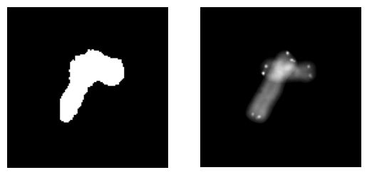
Our brave scientists have 23 chromosome images, and they've asked ChatGPT to perform the following tasks:
- Threshold and normalize each image.
- Rotate and translate each image to create new augmented samples.
- Generate random triplets of grayscale images and occlusions by taking the maximum of the pixel values.
- Keep 100 triplets that meet specific criteria for connected components.
And because we're feeling cheeky, we're allowed to throw in some jokes about their English level and geek slang.
The ChatGPT Solution
First, let's dive into the methods we've used to solve this chromosome conundrum.
Thresholding and Normalizing
We apply a threshold to each image, creating a binary mask. We then calculate the mean and standard deviation of the pixel values within the mask, and normalize the image accordingly.
Here's the Python code for this step:
def preprocess_images(images, threshold):
    preprocessed_images = []
    for image in images:
        mask = (image > threshold).float()
        mean = torch.sum(image * mask) / torch.sum(mask)
        std = torch.sqrt(torch.sum((image - mean) ** 2 * mask) / torch.sum(mask))
        normalized_image = (image - mean) / std
        preprocessed_images.append((normalized_image, mask))
    return preprocessed_images
Rotating and Translating
We rotate each image at 30-degree intervals and apply horizontal and vertical translations, generating a collection of augmented samples.
Here's the Python code for this step:
def augment_images(preprocessed_images, rotation_step, translation_range):
    augmented_images = []
    for normalized_image, mask in preprocessed_images:
        for angle in range(0, 360, rotation_step):
            rotated_image = rotate_image(normalized_image, angle)
            rotated_mask = rotate_image(mask, angle)
            for dx in translation_range:
                for dy in translation_range:
                    translated_image = translate_image(rotated_image, dx, dy)
                    translated_mask = translate_image(rotated_mask, dx, dy)
                    augmented_images.append((translated_image, translated_mask))
    return augmented_images
Generating Triplets and Occlusions
We randomly select triplets of grayscale images and compute the occlusions by taking the maximum of their pixel values. We then perform arithmetic summation and bitwise AND on the masks.
Here's the Python code for this step:
def generate_triplets_and_occlusions(augmented_images, num_triplets):
    triplets = []
    occlusions = []
    for _ in range(num_triplets):
        images_triplet = random.sample(augmented_images, 3)
        occlusion = torch.stack([img for img, _ in images_triplet]).max(dim=0).values
        mask_sum = torch.stack([mask for _, mask in images_triplet]).sum(dim=0)
        mask_and = torch.stack([mask for _, mask in images_triplet]).prod(dim=0)
        triplets.append(images_triplet)
        occlusions.append((occlusion, mask_sum, mask_and))
    return triplets, occlusions
Filtering Valid Triplets
We filter the triplets based on the connected components criteria mentioned earlier, keeping only the valid ones up to a maximum of 100 triplets.
Here's the Python code for this step:
def filter_valid_triplets(triplets, occlusions, max_triplets):
    valid_triplets = []
    valid_occlusions = []
    for triplet, (occlusion, mask_sum, mask_and) in zip(triplets, occlusions):
        connected_components = get_connected_components(mask_and)
        if len(connected_components) == 2 or (len(connected_components) == 1 and mask_sum.max() == 3):
            valid_triplets.append(triplet)
            valid_occlusions.append(occlusion)
            if len(valid_triplets) >= max_triplets:
                break
    return valid_triplets, valid_occlusions
Conclusion
With ChatGPT's help, our scientists can now confidently face the challenges of overlapping chromosomes! By using this dataset with triple occlusions, we can train powerful inpainting models that can assist cytogeneticists in their quest to understand the secrets hidden within chromosomes.
Who would've thought that a humble Dell T5500 with 24 GB RAM and GTX 960 4 GB GPU could uncover the mysteries of our genetic blueprint? Thanks, ChatGPT!